
There are different ways to deal with images on a page. This shows some of the examples.
We will start simple and get more complicated as we go on.
First, just a straight image block
You can add a single image. By default it will appear left-aligned in the editor but centre-aligned in the active page with no text on either side. It can have a caption.
The width is “auto” by default. This put the image right across the page, if it’s big enough. If not, it just makes it as large as its natural size. The image above is 600×600 pixels. The shape of the image is maintained, so if it’s long and thin, it will always be long and thin.
The following one is larger.
Changing the size and location of the image
You can set the alignment of the image to move it to the left, right or centre.
In the centre, it will have no text beside it.
If you align it left or right, it will pull up text beneath it to wrap around the image.
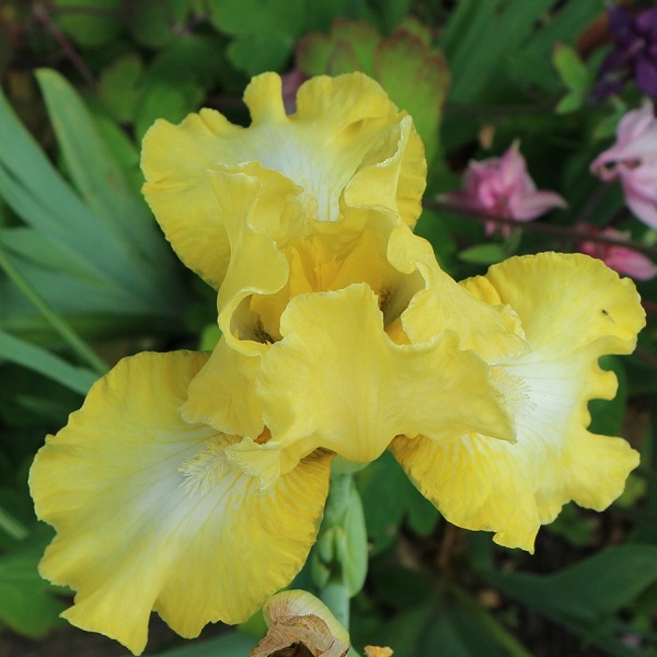
This is a short bearded iris called “Lemon Ice”. It flowers in early May and has a lovely sherbet scent. It is hardy and also very robust. It has survived in my garden for many years and flowers reliably, unlike some others.
Note the editor will also show this text alongside the image.
It continues to put text alongside the image until the text covers all the space available.
This can be a pain if you want to change subjects.
On some themes, putting in a heading will override this and make it appear beneath the image, but not always.
I will make a heading to see what happens with this theme
And see what happens as you carry on typing. Not a lot in this case.
How responsiveness changes what someone sees
If you’re OK with this, then fine. But you need to be aware that what appears on the screen will depend on the width of that screen. If you have a wide device, you will get more text on each line. If you have less, then you will get next text. If you are worried about where your text is in relation to the picture, this is not ideal! In extreme case, you can end up with single words of text down the side. Just try changing the width of your browser to see this.
Media and Text Boxes as the answer
These have a space for both an image and some text beside it. You decide which side the image is and whether the text is aligned top bottom or centre. By default, the image is on the left and the text centre-aligned on the right. On a mobile, the image always appears above the text.
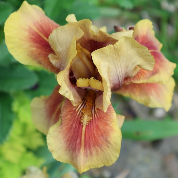
This is a different iris in my garden. I can remember the name but it has a very unusual colouring. It is a tall bearded iris, flowering in late May. It’s more reluctant to flower than Lemon Ice.
This is a different iris in my garden. I can remember the name but it has a very unusual colouring. It is a tall bearded iris, flowering in late May. It’s more reluctant to flower than Lemon Ice.
Adding colour to the background covers the whole height of the image, but does not add a padded colour around the image.
Well, not strictly true, it seems to add some at the bottom, but not other sides.